Calgary Hacks 2022!

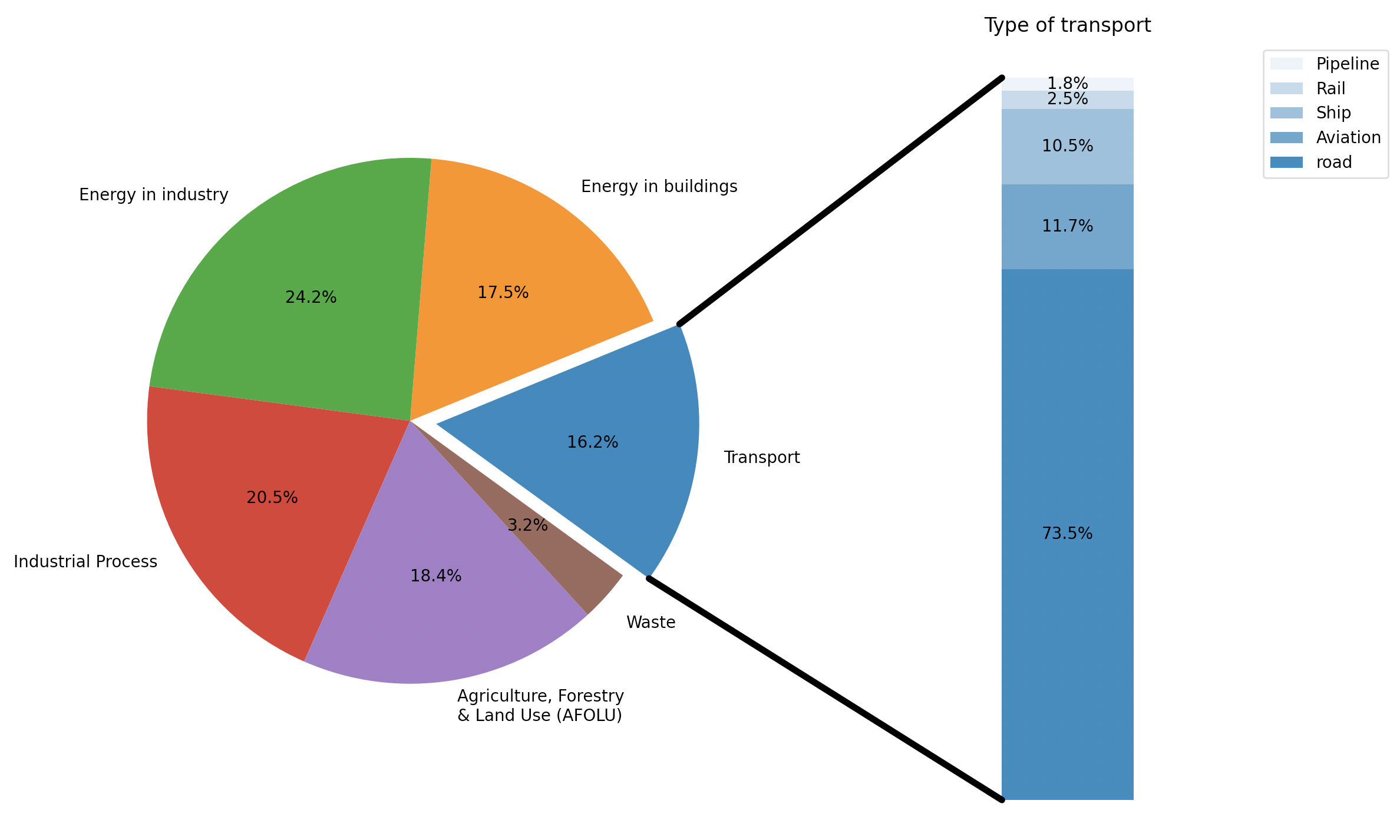
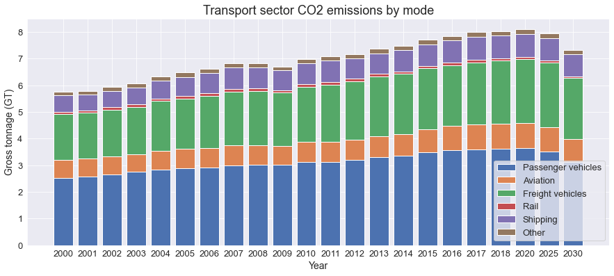
Here we see the breakdown of energy usage by sector represented by a pie chart. The transport sector is our point of interest with a bar that represents the types of vehicles. We notice that the transport sector has an impactful size with road vehicles dominating by a large amount.

Now when we look at the CO2 emissions from transportation over the past 20 years, we can notice a gradual increase year by year. However, in a sustainable development scenario, we can could potentially reduce the amount CO2 emissions from transportations as the graph indicates.

Considering how we have a variety of different types of cars in this day and age, it is important to take into account that they produce varying amounts of CO2. It is no surprise that gasoline cars emit less CO2 than hybrid and electric cars. However, the relative difference can be well illustrated in this graph.

Thinking broadly, we organize the top 10 countries based on carbon emissions.

This graph represents the top 10 countries based on the number of cars they have. Comparing this to the previous graph. We find that there is a correlation between the numbers of cars in a country and the total CO2 emissions in that country.

Looking at the countries that produce the most vehicles, we notice that many countries that appeared in the previous two graphs also appear here. Again, this is a correlation which not necessarily does not indicate causation.